Comparing Renko charts to candlesticks – How different are they?
Technical analysis as we know it today, has come a long way. Most of the books on technical analysis often tend to focus on the three main chart times. Namely, the bar chart, candlestick chart and the line chart.
There are different technical analysis methods that one could use depending on the financial chart style. Technical analysis, after all is all about evaluating historical patterns or behavior to predict future price.
While the line chart, bar chart and the candlestick chart often trump in popularity, there are some custom charts as well. Not as well known, for perhaps many different reasons, these custom charts are quite different.
The main difference is of course in the way they visualize the prices of the financial instruments.
Taking a step back, if we talk about day traders in general, we usually find them moving from one chart type to another. This is perfectly normal as one goes through the experience of trading with the different chart styles before getting comfortable with one.
One of the most common reasons why traders tend to switch their main chart style is the expectation. The general consensus here is that, using a different chart type on a financial chart can yield better results.
But truth is far from it.
While it is correct that the different charts tend to depict price differently, the bottom line is that the information they provide is just the same. Just to extend this further, there are many more chart types than the above three mentioned.
These include:
- Heiken Ashi charts
- Range bar charts
- Point and figure charts
- Renko charts
- Kagi charts
Among the different types mentioned above, we will look at the Renko chart comparing to the candlestick chart.
What is a renko chart?
A renko chart is merely another financial chart type that is used to plot historical prices and plots future prices. The name Renko comes from the Japanese word, Renga, which means brick. Unlike the three traditional chart types mentioned, there is something unique about the Renko charts that makes it quite different.
This uniqueness is the fact that Renko charts are not time based charts. In other words, most of the financial or stock chart types tend to carry price in the y-axis and time on the x-axis. With Renko charts, we only have price plotted on the y-axis.
This leaves the x-axis redundant.
There are certainly some benefits as some point out in using the Renko charts. But it is quite likely that most of this might come from a psychological perspective. Having said that, there is also a bit of truth to it.
In a world of fast paced trading, day traders and speculators wish to gain the extra edge. This edge, most believe might come when you look at financial charts or analyze them differently. This is also one of the reasons why there are so many different ways that one could use the different technical analysis methods (Elliott waves, trend following, breakout and so on).
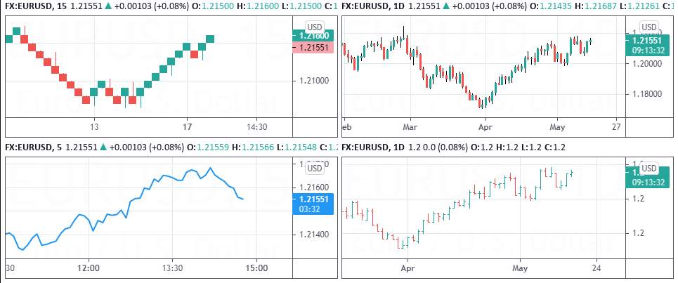
Below is an example of the three main chart types we talked about earlier and comparing it to the Renko charts.

As you can see from the above chart comparison, clearly, the Renko charts stand out. In the next section we will take a look at the differences and similarities between the Renko chart and the candlestick chart.
Differences between Candlestick and Renko Charts
Talking about the differences between the candlestick and the Renko charts, let’s begin with the obvious and one that we touched upon already.
Renko charts do not account for time
This is the first and the most obvious difference between the Candlestick and the Renko chart.
In a candlestick chart, depending on the chart time period that you are using, each candlestick represents that particular period in time. So, for example, if you were looking at the daily chart, then each candlestick represents the price action for one day.
When you move to the previous candlestick, it represents the price action for the previous day. By looking at the candlestick chart, therefore one is able to quickly understand how much price moved during the period in question.
Once the current period ends, a new candlestick is plotted.
With Renko charts, this is not the case. Focus is given purely to the price movement itself. As a result, the time factor is removed.

Many believe that by removing time from the equation, one gets to see a full view of the price action alone. This, in turn is expected to show price trends more clearly. It is also means that a new Renko brick is plotted only if price moves a certain distance from the previous closing price.
As a result, what you get at the end is merely one brick after another, in a series that looks like an ascending or a descending staircase. Traders can of course configure their renko charts to set the correct brick size.
Another common way to configure the Renko chart is by using the ATR or the average true range. You can read more about how to choose the Renko chart using ATR or fixed size here.
Similarities between Candlestick and Renko Charts
When it comes to the similarities between the Renko charts and candlestick charts is the fact that both these two chart types originated in Japan. Hence, both the candlestick and renko charts are quite ancient.
In terms of color, both the charts represent the same thing. When price is rising, or it is bullish, the candlestick (and the renko chart) can be plotted in Green or White color. Similarly, when price is falling or is bearish, both the candlestick and the renko chart can be plotted in Red or Black.
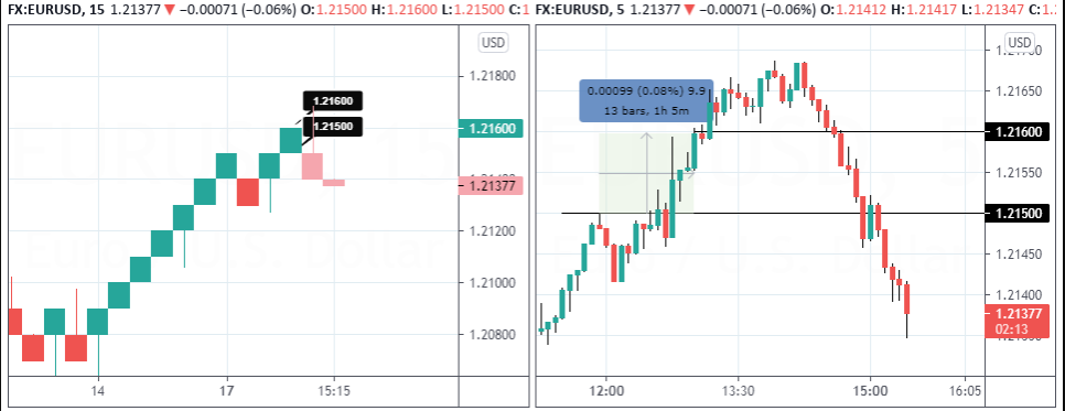
While traditional Renko charts did not have any tails or wicks, newer charting platforms have begun offering this feature too. These Renko tails show how much price has moved in either direction before closing out.
Both the Candlestick and the Renko charts have the open and close prices. If you include the Renko tails or wicks, you can also see the high and low prices as well.
It is important to mention that in a Renko chart (traditional), there are just open and close prices. But as we mentioned, as newer charting platforms start to show the Renko tails, you can also see the high and low prices.
Talking about the question of prices, both candlestick and renko charts show price on the y-axis. But as we mentioned earlier, with Renko charts, a new brick is plotted only when price increases by a multiple.
Both Candlestick and renko charts also show the market sentiment. Of course, it is more evident on a Renko chart because the trends are clearer, comparing to the candlestick chart. It is mostly because of this reason that traders tend to prefer the Renko charts in their technical analysis.
What is the verdict? Are renko charts better than candlesticks?
Eventually one ends up asking this question.
And as with most things, the answer is subjective. Are you someone who prefers the familiarity of using Candlestick charts? Do you like a traditional technical analysis method that makes use of Candlestick charts? Are chart patterns like Doji, Engulfing bar something you like?
If you answered yes to the above, then candlestick chart is obviously the way to go.
But if you are someone who prefers trying out something new or if you prefer to see price trend evolve then Renko charts might be an option worth considering.
Regardless of what charting type you use, bear in mind that you don’t really get an edge in the markets. At the end of the day, what chart type you use purely depends on how comfortable you are with that chart type. It is also important to note that you should truly understand how the specific chart type you are using helps you in your day trading activity.
About the Author
Ranga, is a day trader and an educator. He first started trading over 12 years ago, having tried the different methods. However, over time, Ranga’s preference for Renko charts grew. Eventually, this led Ranga to start https://renkotraders.com, a blog that talks about Renko charts, trading strategies based on Renko charts and a lot more.
